
Interactive eCommerce Website:
Wild Fox Ferments
Instructor:
Details:
16 Week Duration, Fall 2024
Tyler School of Art & Architecture
Methods:
User Experience Design
User Interface Design
Interactive Prototyping
Embrace Your Wild Side
This project began as a continuation of a hard kombucha concept I worked on during Spring 2024. What started as a focus on packaging is now evolving into a full-fledged brand, expanding to include both alcoholic and non-alcoholic kombucha options. For the semester-long project in my Interactive Design course, I created an eCommerce website to bring the brand to life digitally, enhancing its presence and aligning it with the target audience’s eco-conscious, health-oriented values.
Market Research &
Mood Board Creation
To build out a more extensive and digital brand, I conducted market research by exploring the websites of companies like LaCroix, Pepsi, Spindrift, Bully, White Claw, and Truly. I focused on identifying unique design aspects, such as animations, interactive elements, layout design, and hero images, which would make these sites stand out. This research was synthesized into a mood board to inform the visual direction of the Wild Fox website. From there, I deepened my research into the concept, audience, and market, creating personas to define the brand’s target audience and how the website would cater to their needs.

Case studies show that engaging visuals can boost activity by 30%, and over 80% of consumers engage more with brands that share their values and journey.
Research Overview:
How Can We Stand Out?
Wild Fox Ferments is a whimsical, West Coast-based brand dedicated to crafting hard kombucha beverages that balance adventure, wellness, and sustainability. The brand appeals to free-spirited adventurers who value eco-friendly practices and health-conscious choices.
To develop a brand experience that resonates with today’s eco-conscious and health-savvy consumers, extensive research was conducted on audience preferences, e-commerce trends, and industry challenges. Transparency in ingredients and sustainability claims emerged as key drivers of trust and loyalty, with 62% of consumers prioritizing ingredient clarity when choosing alcoholic beverages. The target demographic—specifically health-conscious Gen Z and Millennials—values low-calorie, probiotic-rich, and gluten free options that align with their lifestyle of balance and wellness.

A challenge was standing out in a niche category and oversaturated market of hard seltzers. What separates Wild Fox is that it employs vibrant, nature-themed visuals, an intuitive website design, and a mission that resonates with the audience. The website features whimsical illustrations, a clean layout with clear navigation, and a streamlined shopping experience.
Wild Fox Ferments was created for those who seek bold experiences. By combining eco-conscious practices with adventurous branding, it offers a unique experience that connects its audience to nature and their wild side!
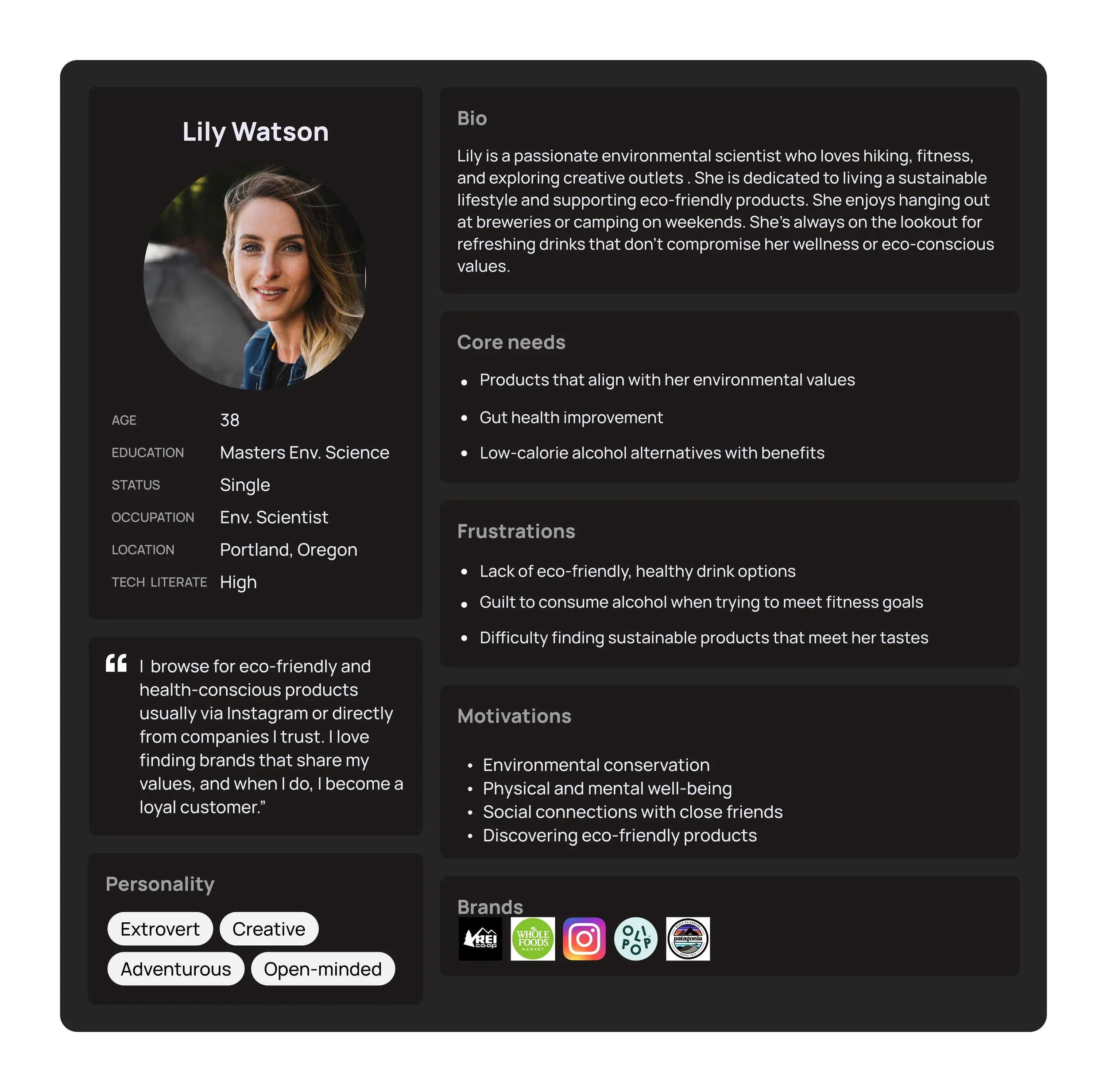
Persona Development:
Who’s the Target Consumer?
The personas represent an eco-conscious, adventurous audience who values sustainability, wellness, and vibrant experiences. They also act as a way to help further develop the brand and get to know the target audience better. Who will be buying this product? What do they value? How can this brand fit into their lifestyle?


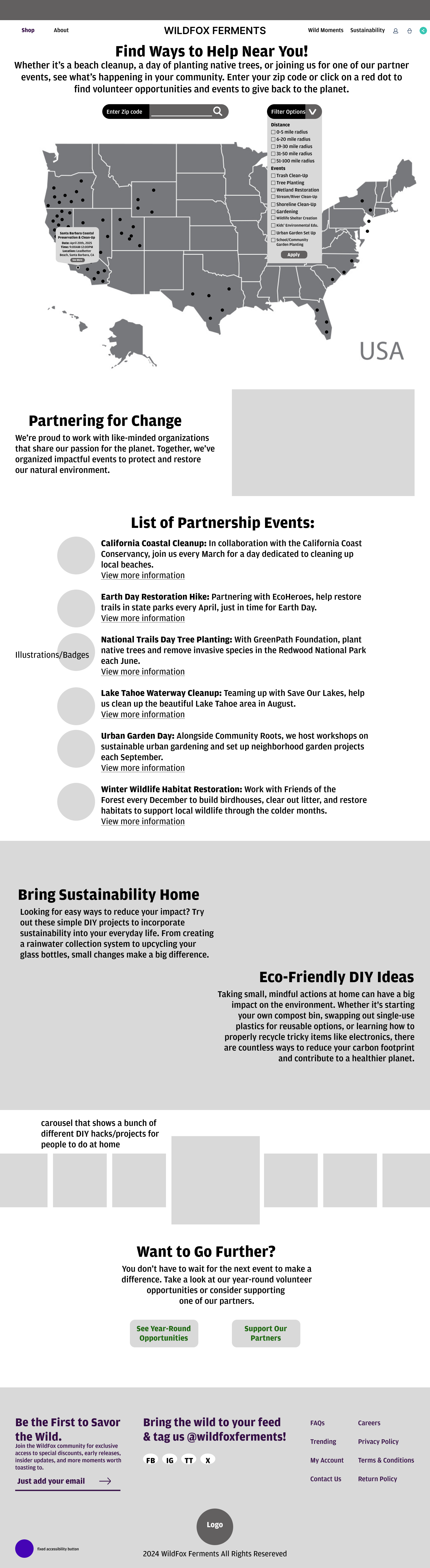
Site Maps, User Journeys, & Wire Framing:
How Will Users Interact?
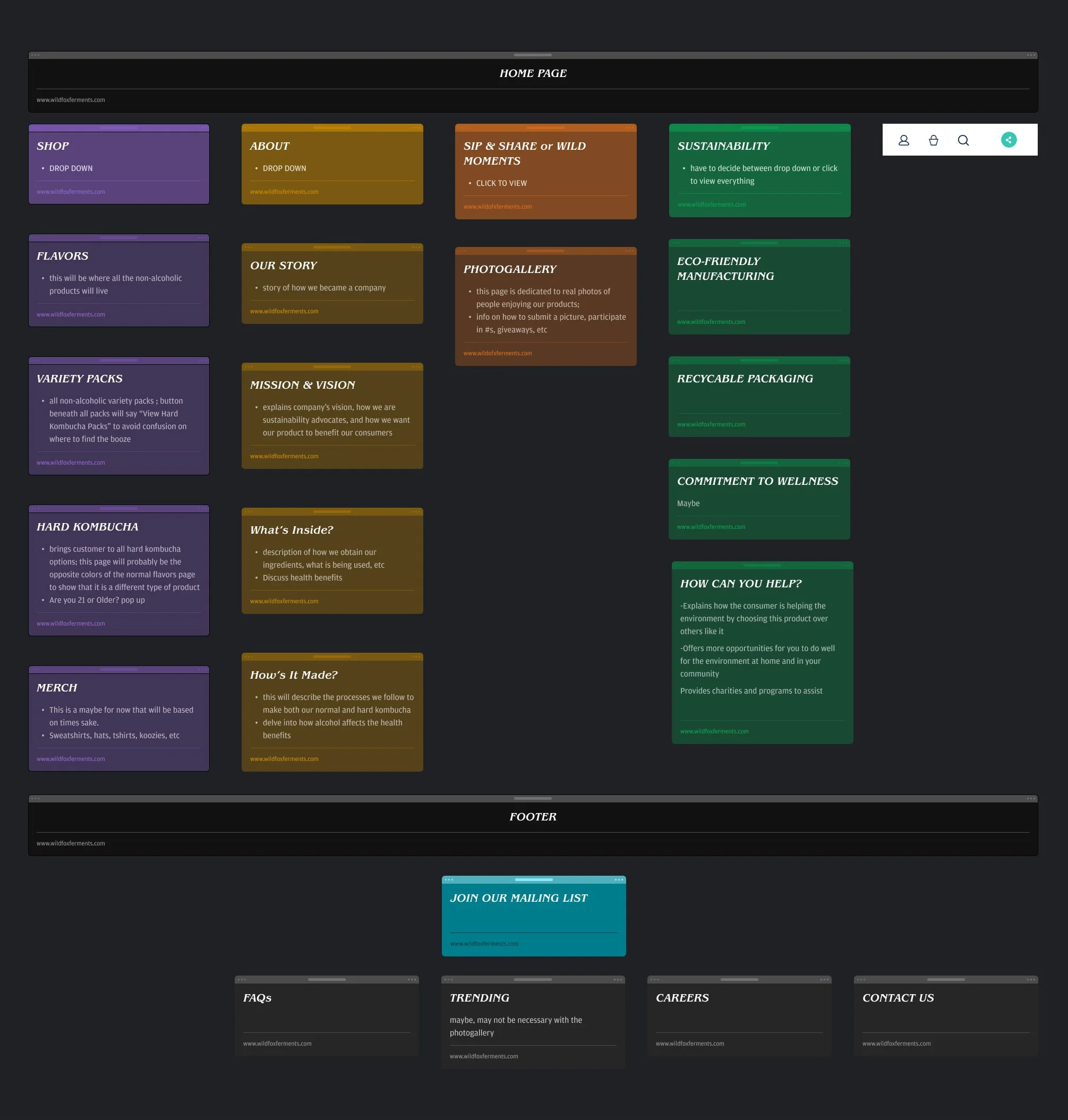
Next, I created a sitemap, outlining key pages such as the shop, about, gallery, sustainability, and homepage. The sitemap is valuable for defining the structure and navigation flow, ensuring users can easily find what they’re looking for.
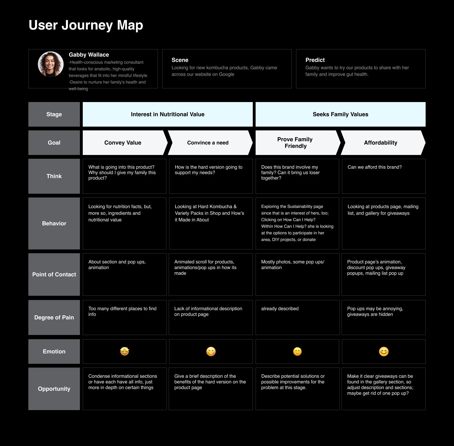
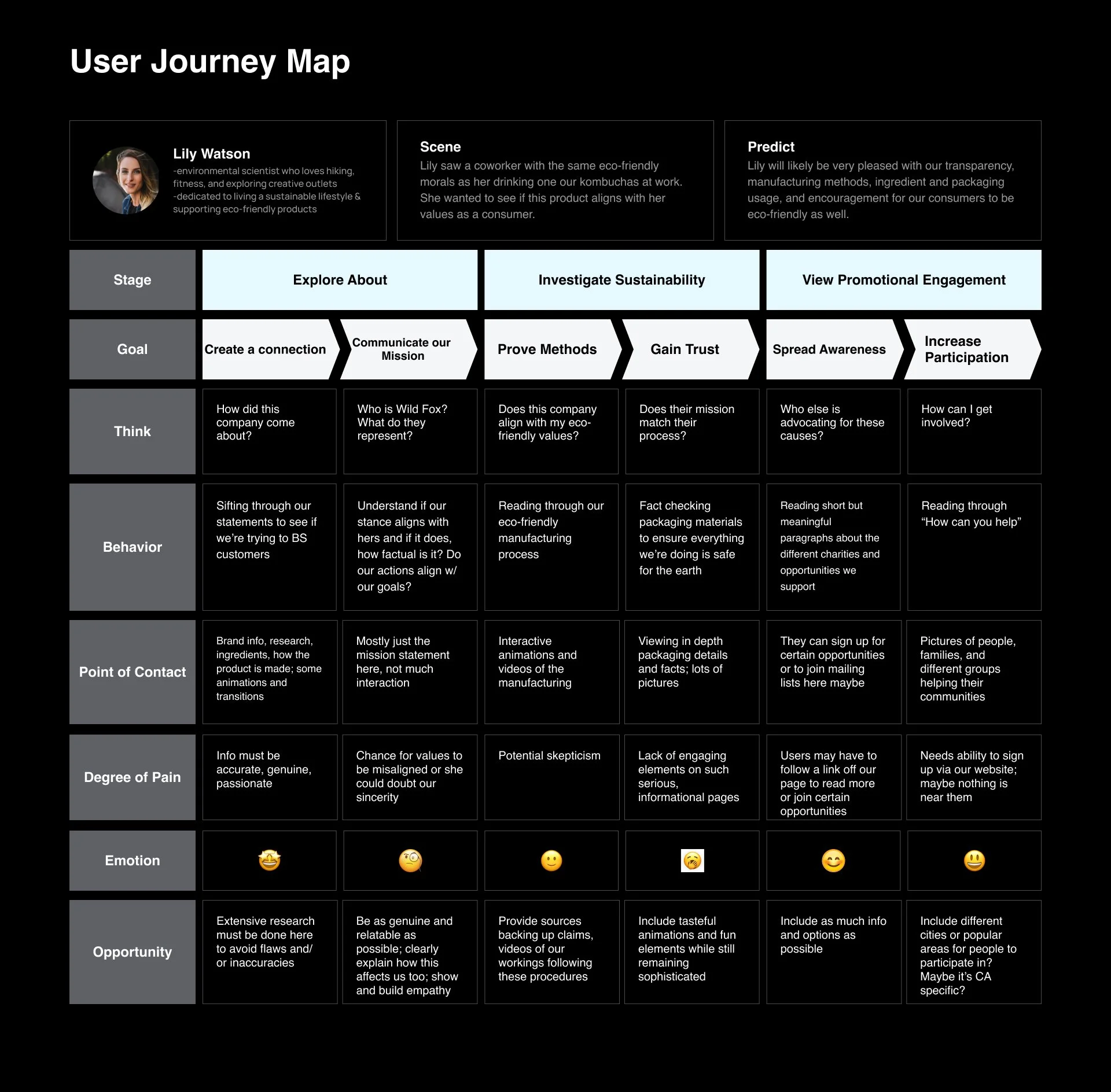
This site map paved the way for the user journeys. These were crucial as they allowed me to visualize how different personas would interact with the site from entry to purchase. It helped identify potential pain points and moments of delight, enabling a more tailored experience that aligned with user motivations, behaviors, and expectations.
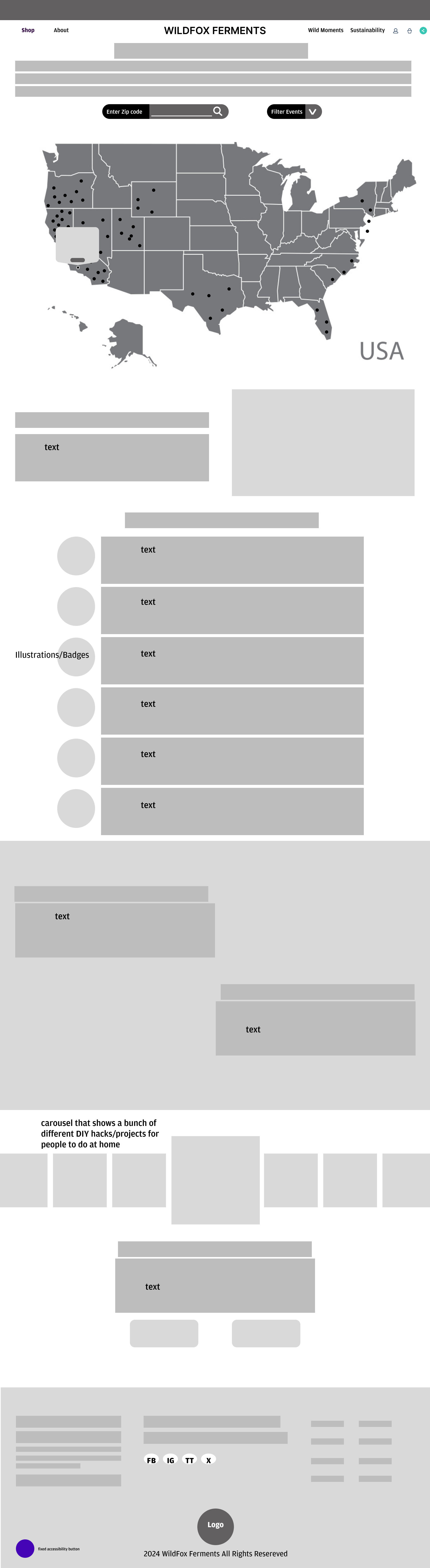
Afterward, I moved into wire framing, where I built the structure of key pages like the homepage, flavors page, hard kombucha page, and mission page. This step helped identify the necessary assets, photos, and iconography for the site and how users would interact with the content.
-
![]()
Site Map
-
![]()
Social Journey Map
-
![]()
Duality Journey Map
-
![]()
Sustainability Journey Map


Prototyping & Animation:
Bringing the Site to Life
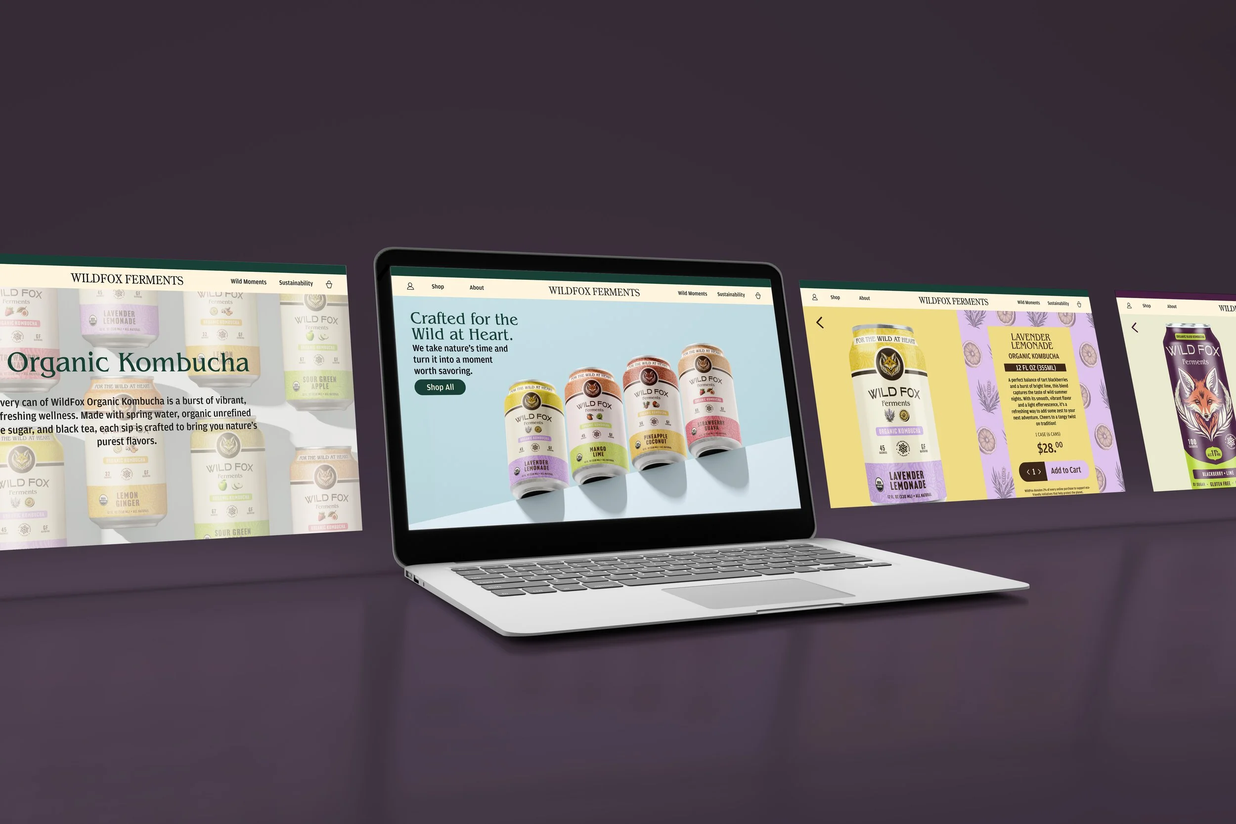
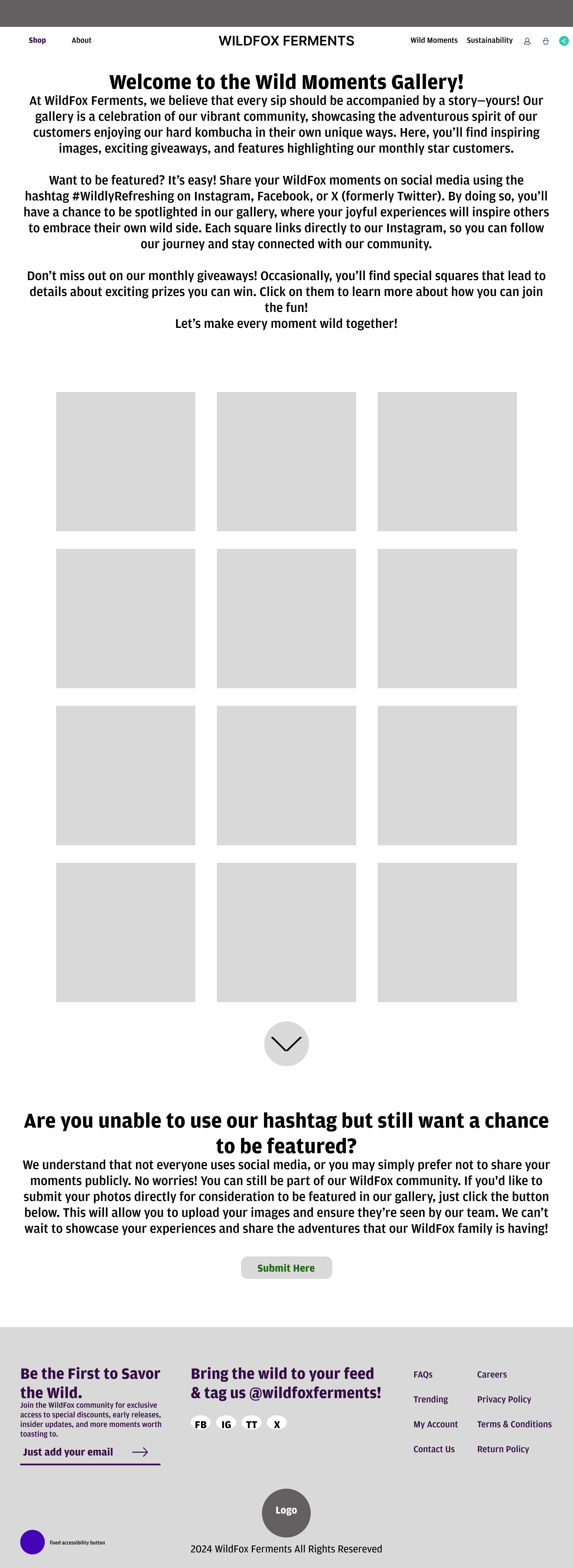
From wire framing, I advanced to low-fidelity prototyping, adding content and outlining animations, navigation, and other interactive elements. This step helped me storyboard how the website would look and feel in action, from hover states to interactive carousels.


Asset Design & Variants:
Expanding the Brand
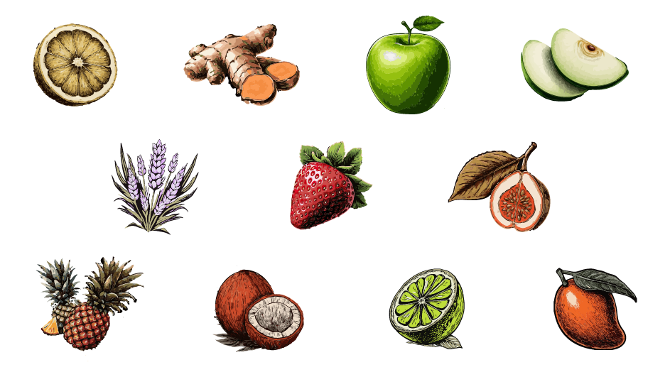
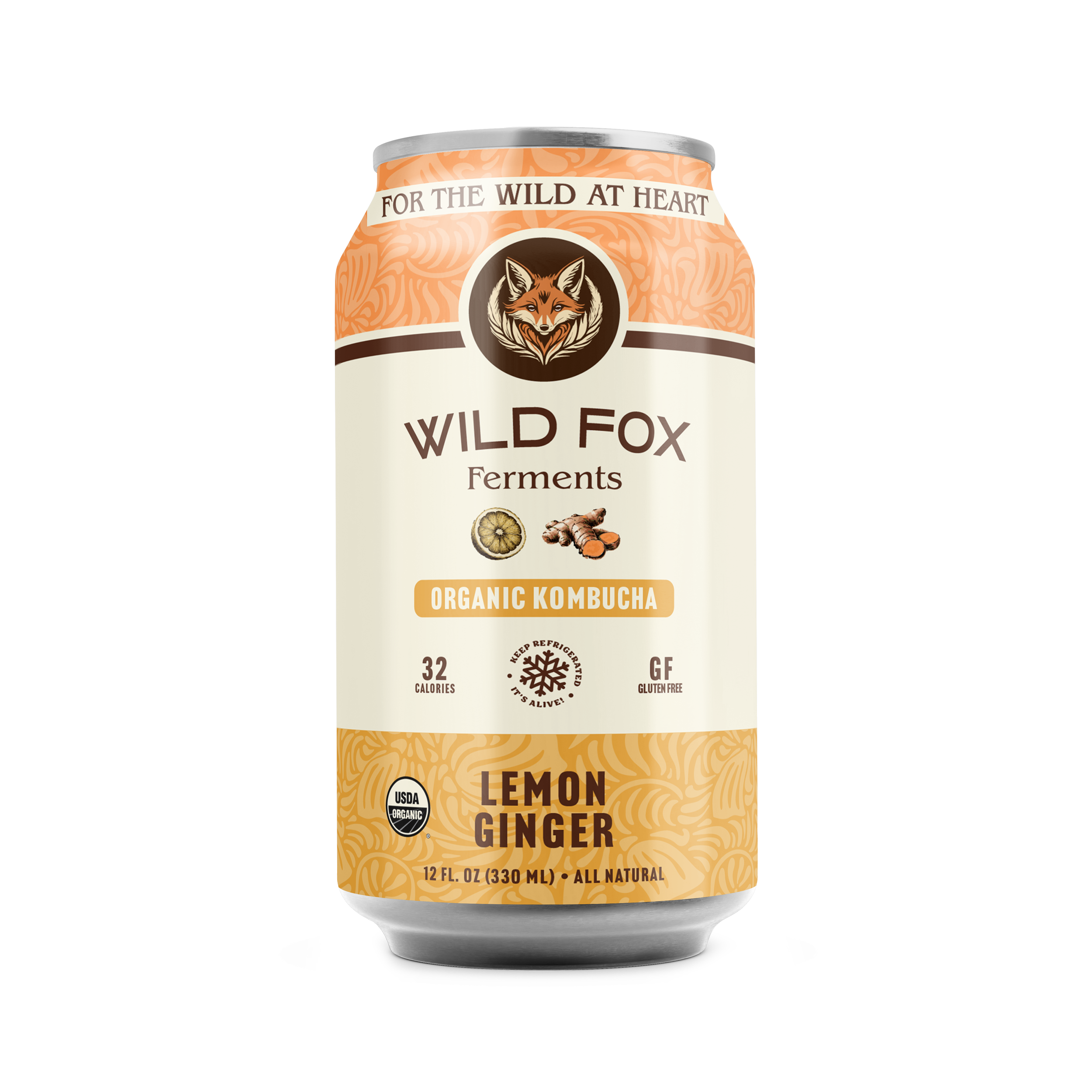
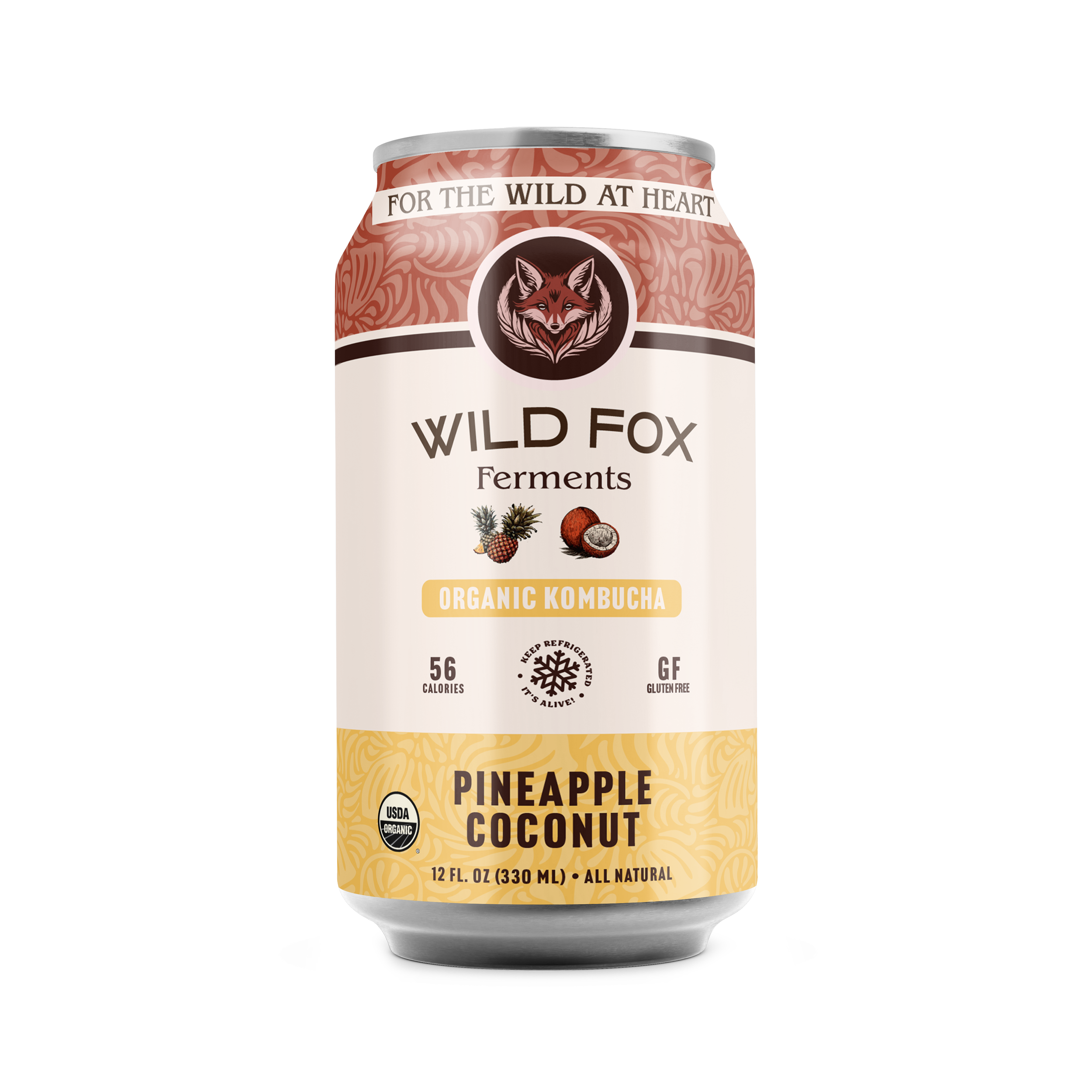
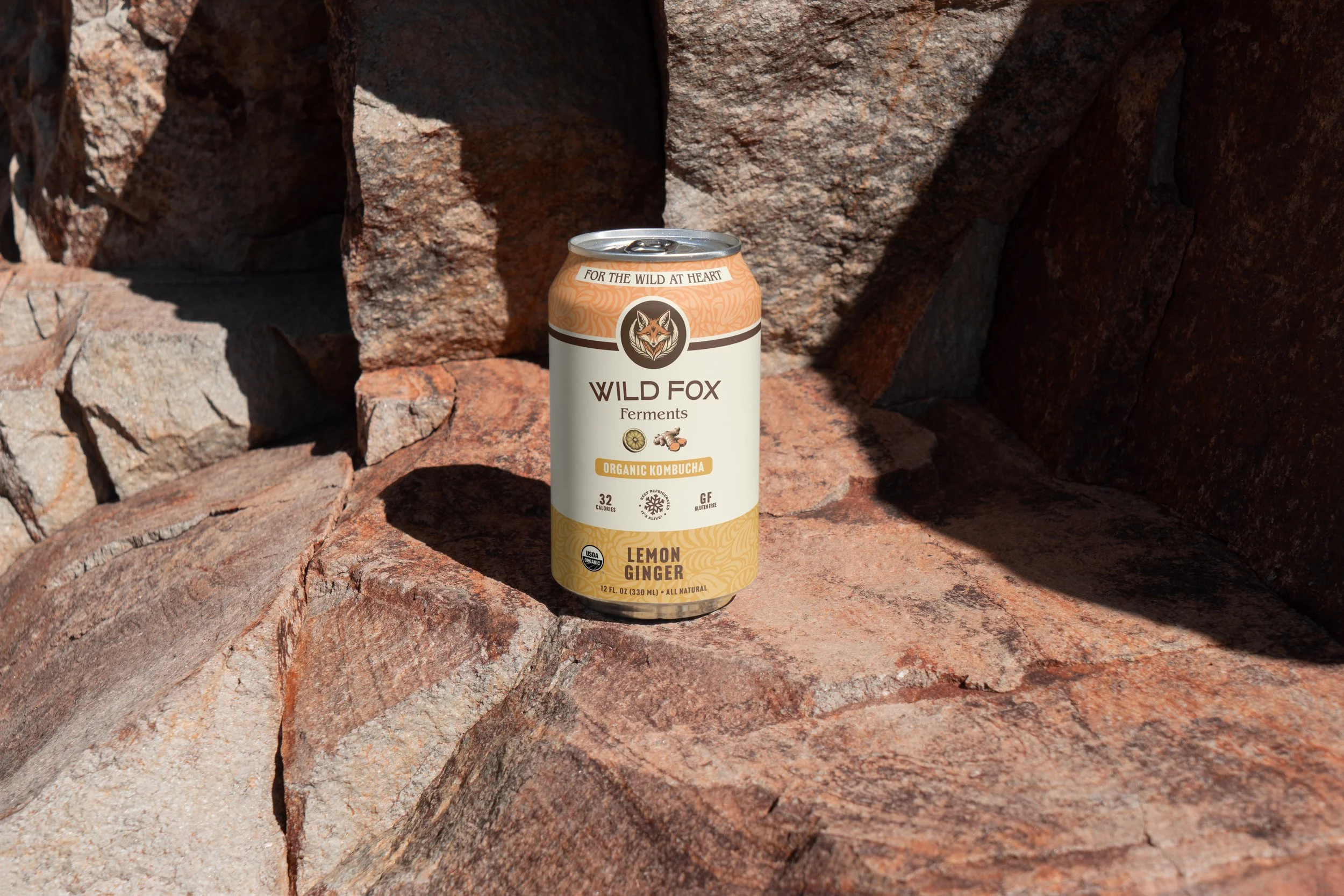
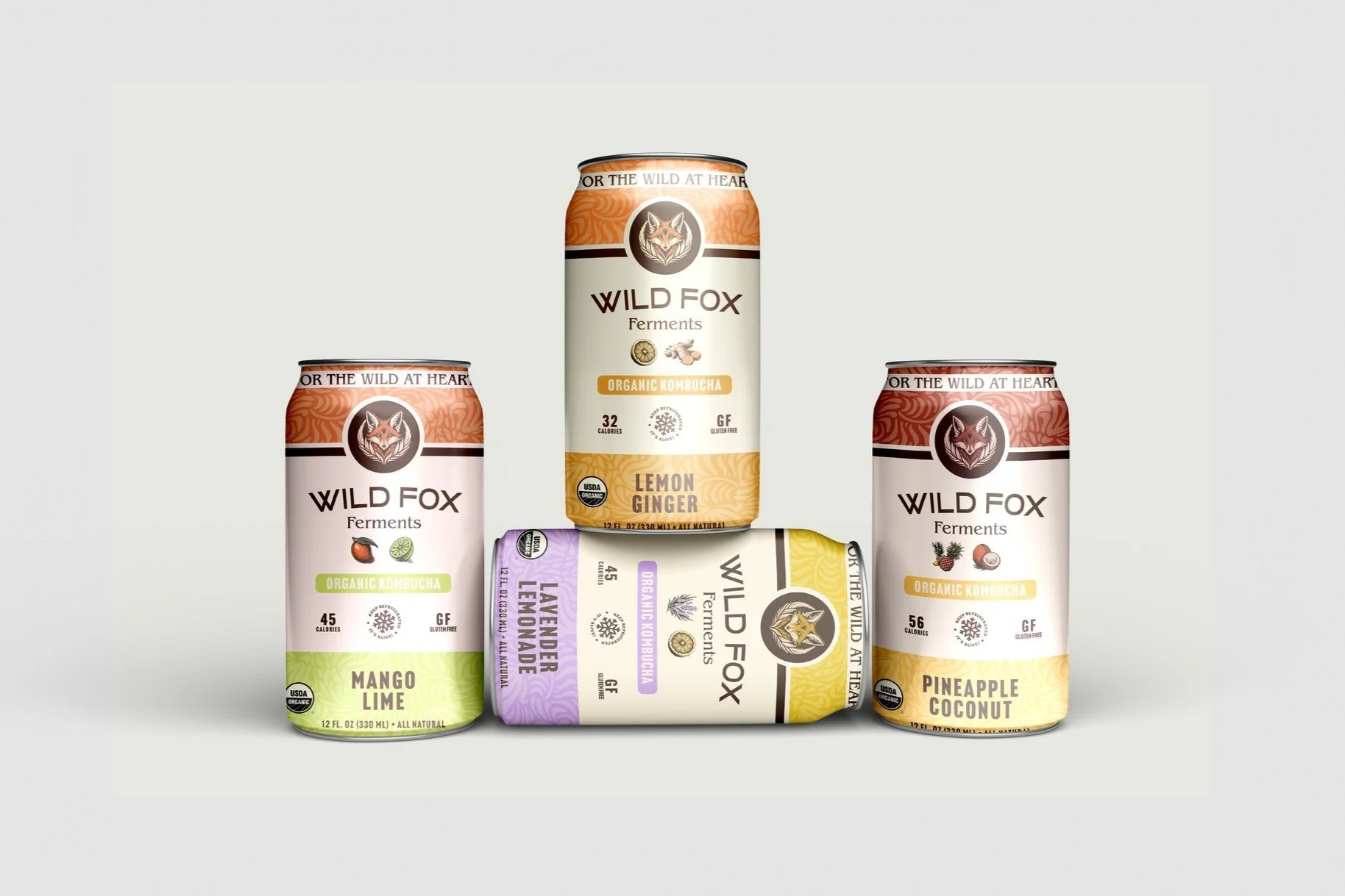
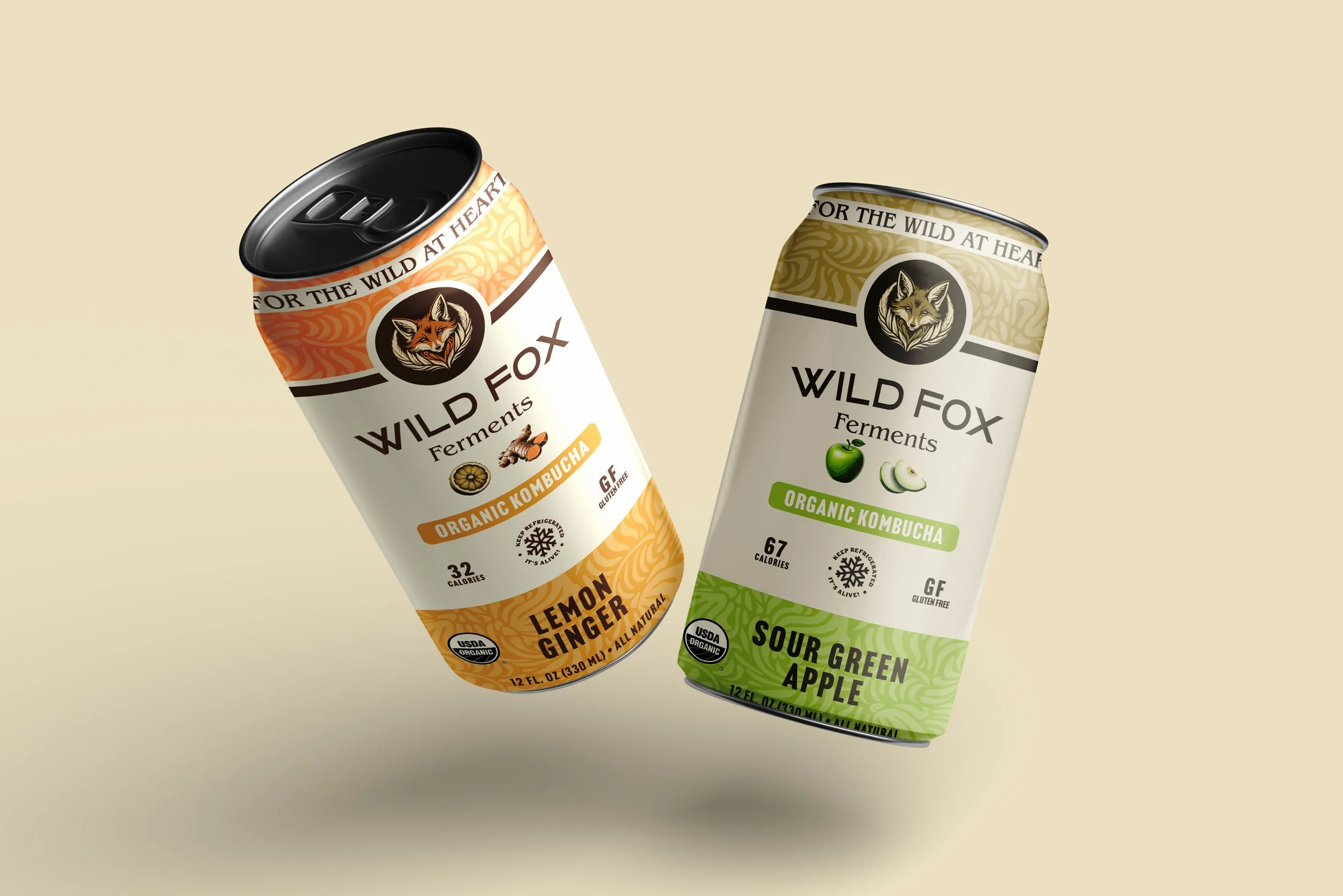
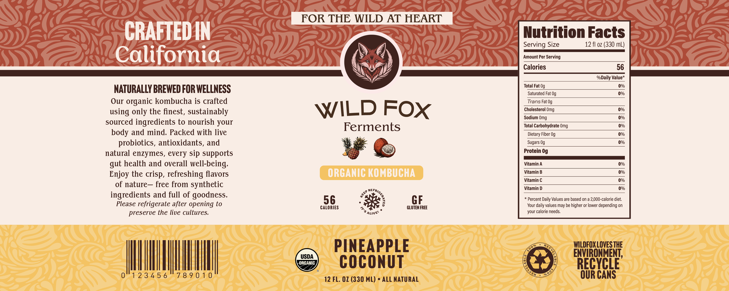
As the design process progressed, I realized something was missing. I briefly paused my prototyping to develop the expansion of the brand’s offerings. I created six new can designs for Organic Kombucha (non-alcoholic) using Illustrator, including fresh fruit iconography (based off of image created by FireFly, edited in Illustrator) for each variant. This additional design work, though time-consuming, enriched the website’s content and helped create a cohesive brand experience.


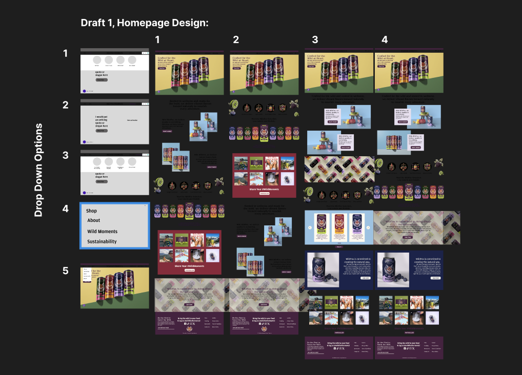
Designing the Homepage:
A Glimpse Into the Process
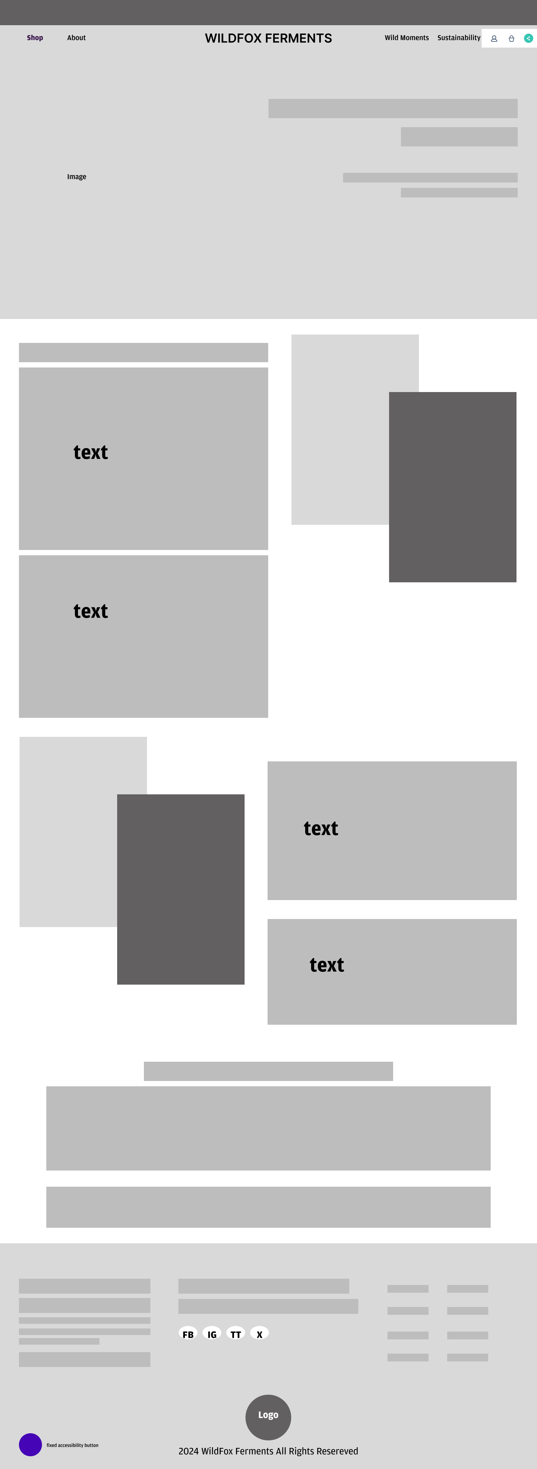
Throughout my process, I paid close attention to the visual design of the homepage and spent time experimenting with different layouts to achieve a balance between uniqueness and usability. Here, you can see an array of different layouts and nav drop downs I experimented with.
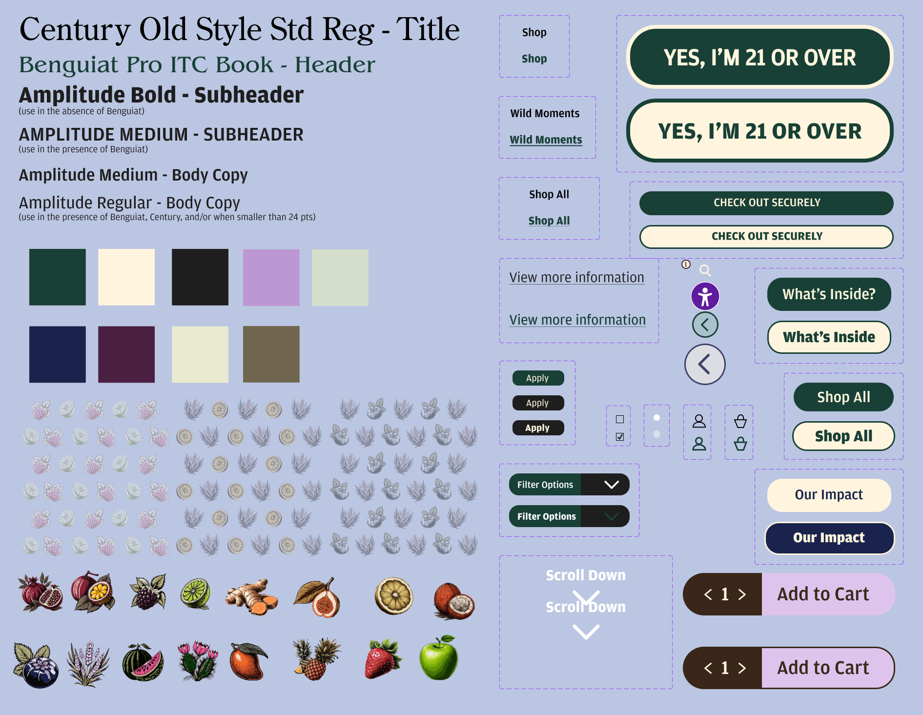
Animation & UI Kit:
Defining a System
The most rewarding part of this project was the animation phase, where I created the interactive elements that brought the site to life- hover states, functioning buttons, drop-downs, and more. This step brought the site to life, allowing me to experiment with Figma’s capabilities and enhance the user experience. I also created a UI kit that documented all the design elements, including animations, buttons, fonts, colors, and iconography, so the design could be handed off to a development team for future implementation.
Final Reflection
This project pushed me to fully embrace the UX/UI process from start to finish, showing me just how impactful each step really is. Mapping out site architecture, building user journeys, and experimenting with wireframes taught me the importance of structure before style. Diving into layout variations, visual hierarchy, and custom style guides gave the site a sense of realism that made every design choice feel intentional. If I were to do it again, I’d spend even more time testing different layouts early on and gathering feedback through user testing to catch usability gaps before getting too deep into the visuals. Overall, this project deepened my appreciation for the design process and sparked an even greater interest in designing thoughtful, experience-driven websites!

