Official University Brochure:
Temple’s Office of Global Engagement

Instructor:
Lisa Meritz
Stephen Hesson
Details
4 Week Duration, Fall 2024
Temple University’s Office of Global Engagement
Typography & Information Hierarchy
Branding Consistency
Visual Communications & Infographics
Print Production
Methods
Contributing to a Global Mission Through Design
During my internship with Temple University’s Office of Global Engagement, I supported the communications and marketing team in promoting international programs and resources for both incoming and current students around the world. The office plays a pivotal role in promoting cross-cultural exchange, providing services for global students on campus, and encouraging al Temple students to study abroad. My work contributed to outreach efforts that directly impacted prospective international applicants, current students seeking study abroad opportunities, and stakeholders invested in Temple’s global presence.
Introducing the Directive:
Identifying the Need
One of my most significant projects was designing an
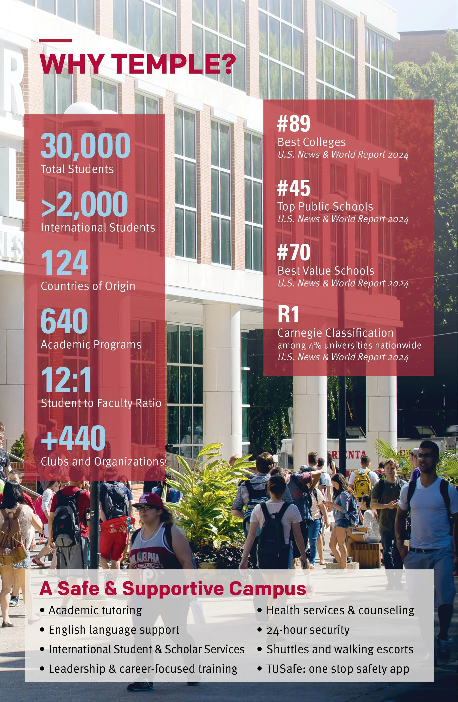
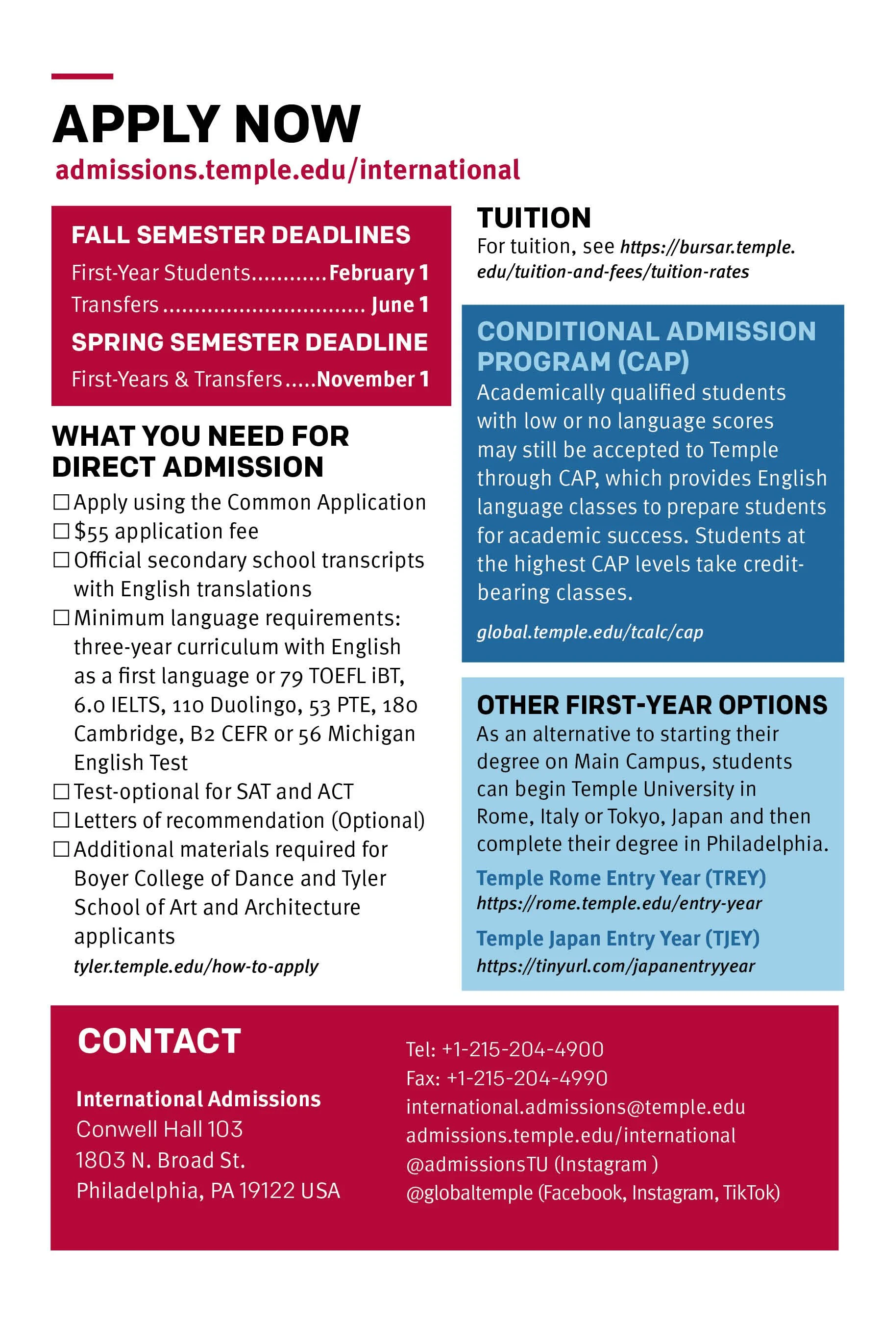
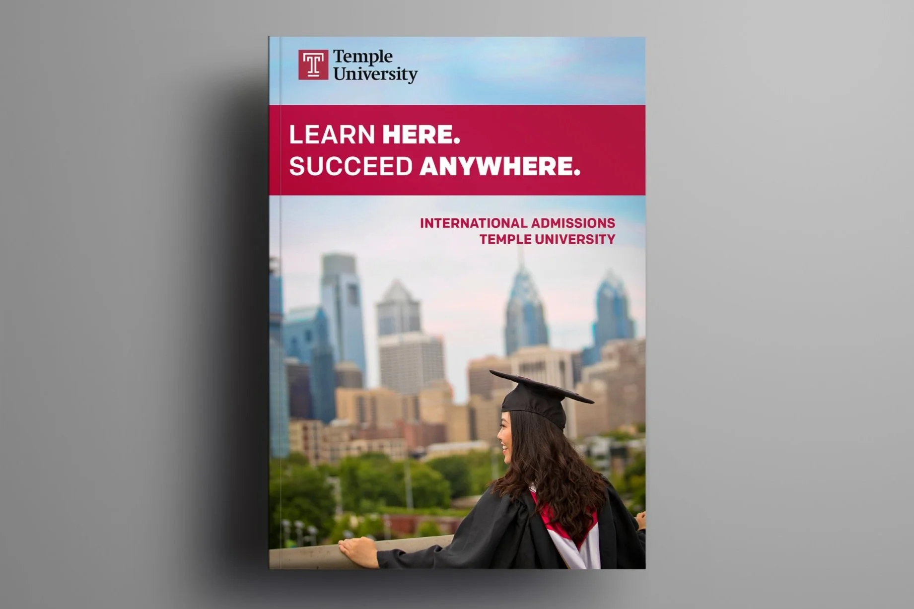
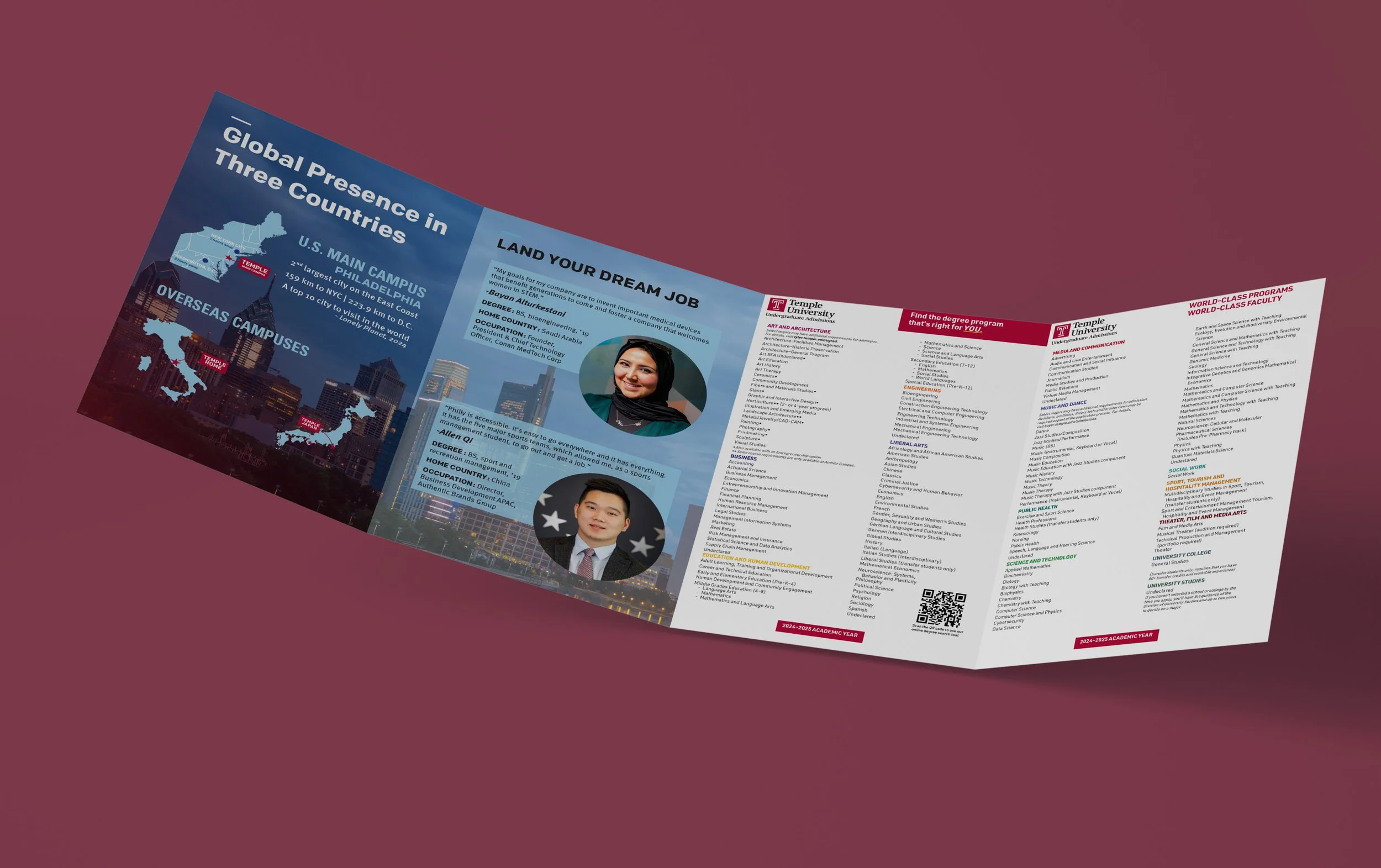
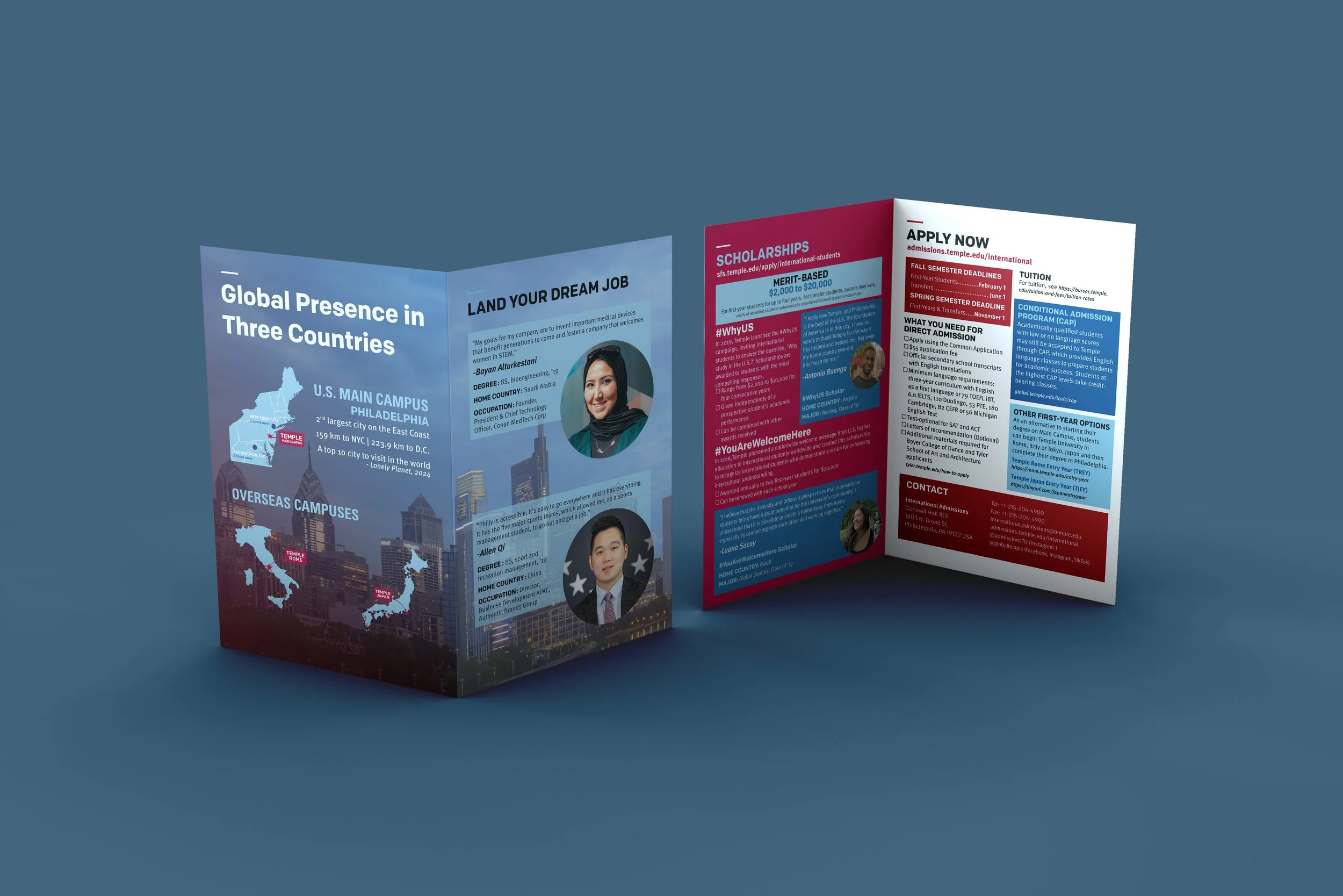
8-page brochure intended for both print and digital distribution. This piece is shared annually with hundreds of prospective students, families, and partner institutions around the world, as well as Temple’s international & main campus communities. I was responsible for designing the entire brochure from layout to final production, ensuring clarity of information while maintaining consistency with Temple’s brand guidelines.
The Method:
Designing the Blueprint
The project started with a blank InDesign document and a single example from the previous year’s brochure. From there, I took the lead on all design decisions, collaborating with my team to ensure the final product met their needs and vision. Balancing text-heavy sections with mixed-content pages, I worked to create a design that was visually engaging, professional, and easy to navigate. Layout design has always felt like an intricate game of Tetris—a challenge I always love solving!
The Process:
Creating Visual Hierarchy
Working within Temple’s established brand guidelines, I adhered to their typefaces, color palettes, and layout systems to ensure brand consistency and recognizability. Through the use of bold headers, color-blocked callouts, and standardized formatting for student quotes and bios, I created a clear visual hierarchy that guided readers smoothly through the content. The result is a brochure that feels distinctly “Temple”.
Content Refinement:
Setting the Standard
Though most of the content was provided, I was encouraged to adjust copy where necessary to improve clarity, formatting, and tone. For instance, I edited the "Majors" pages to resolve structural inconsistencies, adding a pop of color to make the information more inviting and visually dynamic.
Final Adjustments:
Collaborating for Excellence
The iterative process involved rounds of feedback from my team, which allowed me to strengthen more than just my design skills—I was able to exercise responding to revisions with flexibility. Seeing the final product distributed globally and on campus was an incredibly rewarding experience and affirmed my passion for impactful design!
-
![]()
Cover Page
-
![]()
Page 2
-
![]()
Page 3
-
![]()
Page 4
-
![]()
Page 5
-
![]()
Page 6
-
![]()
Page 7
-
![]()
Page 8